

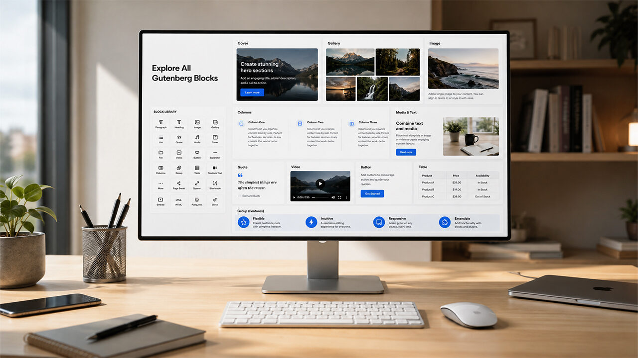
WordPress 7.1 ships with a block for almost everything, and a theme has to dress all of them — not only the three it would have chosen. This page is full width, with no sidebar, so each block gets the whole measure and you can judge it at the size it will really be used.
Any page can be set this way: open it, look for Pulsar — page options under the editor, and choose Full bleed. The same box can force the sidebar back on for a single page when the rest of the site does without it.
Cover
A picture with words on top. The theme guarantees the veil between the two, whatever the photograph does, because white text on an unpredictable image is a gamble the reader loses.
Words over a photograph
And a line underneath, still readable.
Columns
Two or three side by side on a desktop, stacked on a phone. Columns are for things that belong together, not for making a page look busy.
First
A column keeps the type size of the body: shrinking it to fit more words is how a page stops being read.
Second
The gap between columns is wider than the space between lines, so the eye never runs from one column into the other.
Third
Three is the practical limit on a page this wide. Four columns of prose is a table pretending otherwise.
Media and text

A picture and a paragraph, locked together
Useful for a product, a person, a place. On a phone the two stack, picture first, because a half-width photograph beside four words is worse than either alone.
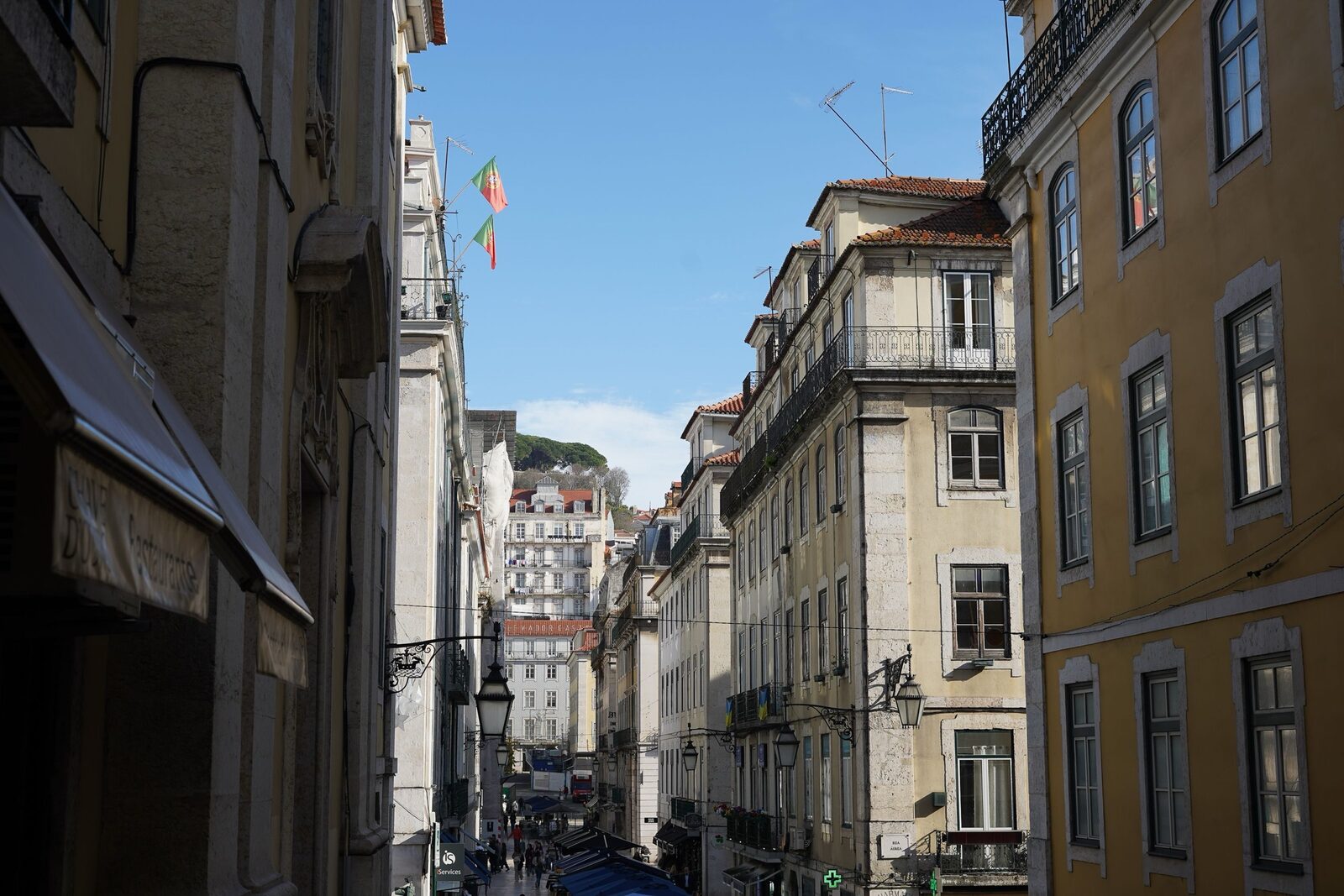
Gallery
Details
The block that folds a section away until it is asked for. Good for a specification list, a long disclaimer, an answer to a question most readers already know.
What happens to these settings when the theme updates?
Nothing. They live in your database, not in the theme’s files, and an update replaces only the files.
Group with a background
A note set apart from the flow
A group with a background is the polite way to say “this is an aside”. The text inside keeps the body size, and the box keeps the corner radius the rest of the theme uses.
Preformatted and verse
Preformatted text
    keeps    the spaces
        exactly where they were.
Cover with a fixed background
The same block with Fixed background switched on: the photograph stays where it is while the page scrolls over it. On a touch screen it falls back to an ordinary cover, because no version of iOS has ever supported a fixed attachment and what it does instead is worse than not doing it.
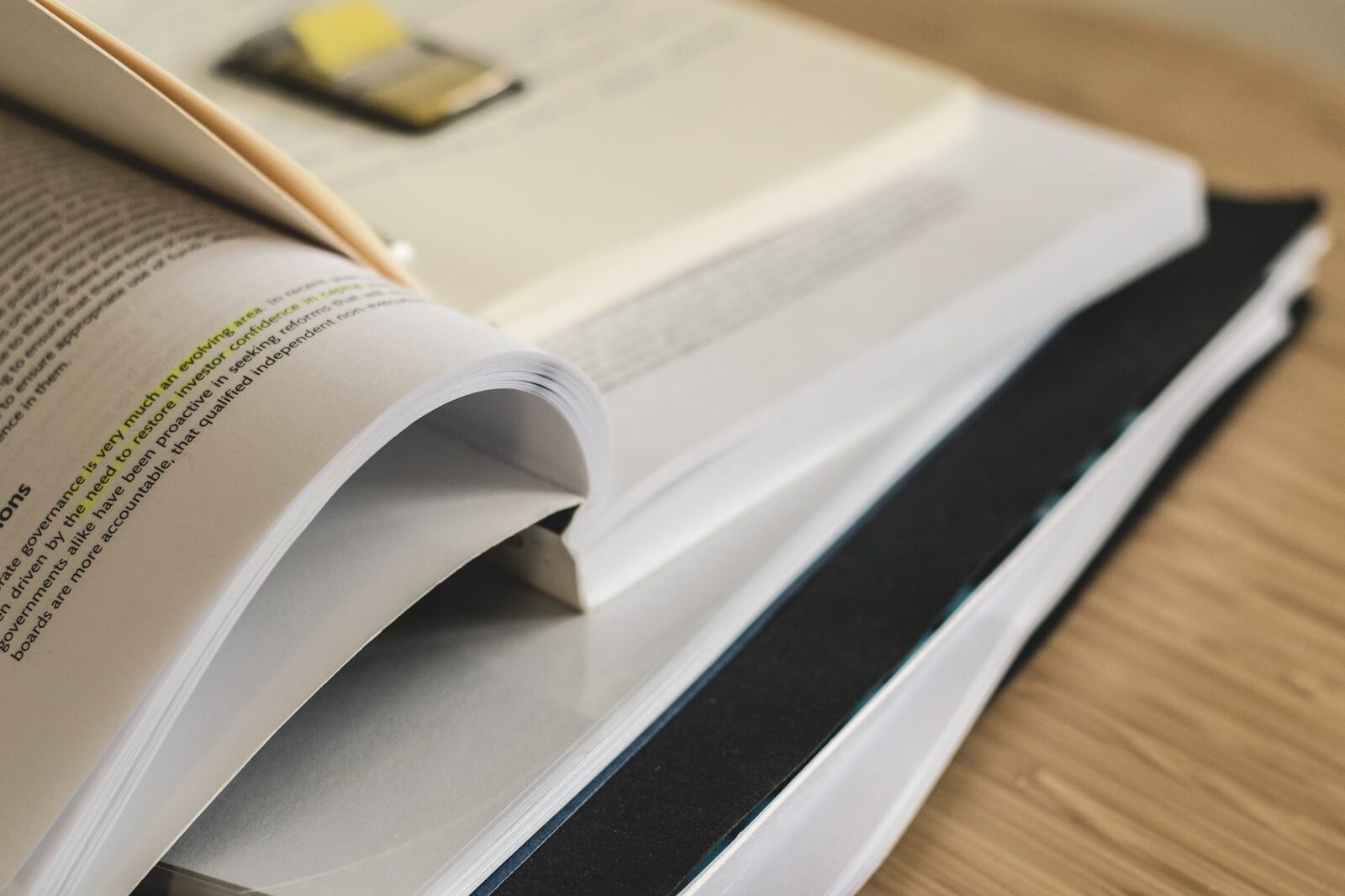
The page moves, the picture does not
Wide and full width
A block can step outside the measure of the text. Wide goes a little past it on both sides; Full takes the whole page. Both are for pictures and covers, never for paragraphs: a line of text as wide as a monitor is a line nobody finishes.
Table
| Block | Set apart by | Behaves on a phone |
|---|---|---|
| Cover | A photograph and a veil | Keeps its height, drops the parallax |
| Columns | Space between, not lines | Stacks in order |
| Gallery | A shared crop | Two across, then one |
| Table | Rules under the rows | Scrolls inside its own box |
Lists
- A bulleted item, with a nested one under it:
- the second level, closer to its parent than to the item after it
- and the item after it, back at the first level
- Numbered, with the figure in bold.
- Because a number is a label, not a word.
Quotations
The quote block is the same here as it is in an article: a bar in the brand colour and the same colour, much diluted, behind it.
The theme, about itself
And the pull quote, set between two rules, for the sentence that has to be read first.
Code
// Every filter the theme exposes is documented, and this is one of them.
add_filter( 'pulsar_dequeue_block_library', '__return_false' );
Buttons
Embed
A video keeps its proportions at every width, and the theme never lets it push the page sideways.
Spacer and separator
A spacer adds silence without drawing anything; a separator draws a line. Use the first between two ideas that belong together, the second between two that do not.
If a block you use is not on this page, it is still styled: the theme dresses the whole core set and leaves the editor’s own spacing alone where WordPress already gets it right.