Skip to the demos
Pulsar

WordPress theme, version 1.0.0

Pulsar

A multipurpose theme for news sites, magazines and blogs.

The homepage is assembled from 12 blocks you order yourself. Colours, type and layout are set in one panel, with a live preview of the real posts. Every demo below is a preset: one click sets the whole site up, and everything stays editable afterwards.

  • WordPress 6.3 and later
  • PHP 8.0 and later
  • Child theme included
  • No page builder required
  • English and Italian

Demos

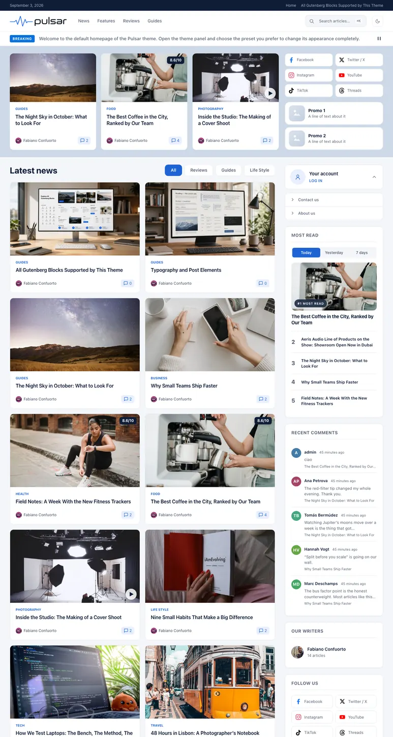
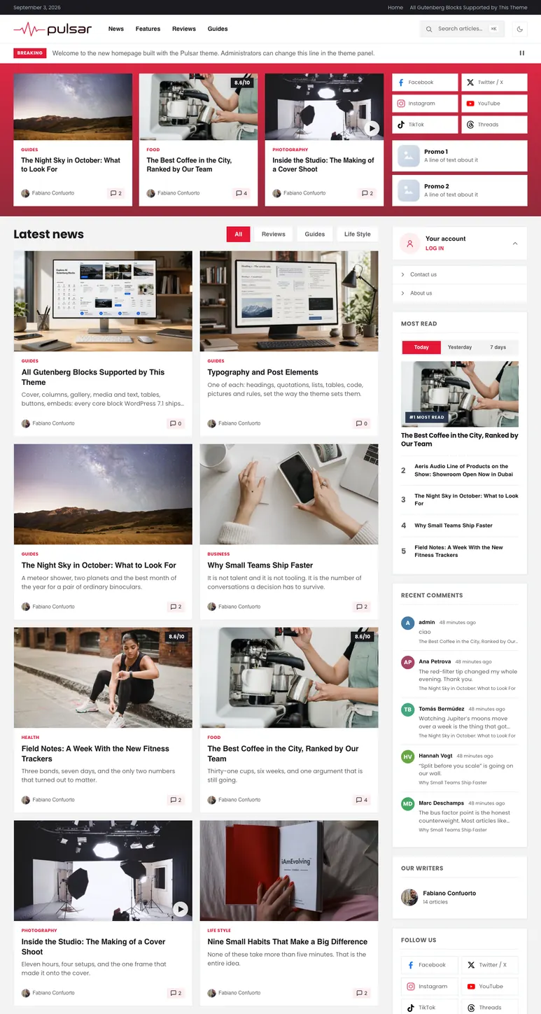
2 demo sites, imported in one click.

A demo is a preset plus its content. Applying one sets the brand colour, the corners, the type, the header and the homepage blocks together, then hands the site back to you with every setting still open. The articles and photographs of the demos are included in the theme and import from the panel.

Each demo runs the same theme files. Nothing in a preset is locked: it writes the settings the panel would have written, and you carry on from there.

The homepage

Twelve blocks, in the order you decide.

The front page is a list of blocks you drag into place. Each one draws its own articles, with its own filter by category or tag, its own order and its own card style. Two of the bands keep a sidebar of their own, so the same widget is never shown twice on one page.

  • Stories, hero, categories across the top band, full width.
  • Grid, compact list, carousel, bento, timeline, post list, extended timeline in the column, beside the sidebar.
  • App banner and newsletter in the bottom band.
  • Newest, oldest or random order per block, and a block can skip the articles the blocks above it already showed.
  • A second title for phones, so a long heading can become a short one where the column is narrow.
Full width bands top and bottom, column bands in between, each with the sidebar it reserves.

The opening block

Five hero layouts.

The hero decides what the rest of the page means. All five draw from the same filters, take the same background — flat or gradient — and fall back to the most recent posts when a filter matches nothing, so a fresh install never opens on an empty page.

  • Layout A

    One large card with two stacked cards beside it.

    A clear lead story.

  • Layout B

    One large card with a compact list beside it.

    A blog, where the list is the archive.

  • Layout C

    A carousel of cards with a sidebar next to it.

    News: most stories above the fold.

  • Layout D

    Layout C on a dark band, with room for a video and two buttons.

    Launches, campaigns, tech.

  • Layout E

    A large media panel with a headline, buttons and an optional carousel.

    Features and travel.

Article cards

Nine card styles, and you decide what each one shows.

Every block chooses a style; every style has its own switches — where the category sits, whether the author, the avatar, the date, the comment count and the excerpt appear, and how the date is written. The panel previews each one with your real posts.

  • Standard

    Cover on top, text below. The card most of the site is made of.

  • Hero

    The large card of the hero block.

  • Cover story

    Text laid over the picture, for a full bleed card.

  • Side

    Thumbnail on the left, text on the right. Used by lists.

  • Compact

    Small and dense, for sidebars and tight columns.

  • List

    Picture left, headline at reading size and the opening of the piece beside it.

  • Extended timeline

    The same row, hanging off a dated rule.

  • Timeline

    The hour, the title, and a thumbnail if you ask for one.

  • Bento

    One big card and smaller ones, in up to three columns.

A post with the review box switched on carries its score in the corner of every card it appears on. A post whose format is Video carries a play badge on the picture. Neither needs a card of its own.

One brand colour, and the palette follows

The tints, the pills, the hovers and the borders are worked out from the brand colour instead of being fixed, so a site that has only changed that one field is drawn in its own colours throughout. Corners are a single dial: every radius in the theme is its own size times one number, from the design as drawn to a squared off site.

  • Brand
  • Tint
  • Ink
  • Accent

Twelve type families, served from your own site

Neutral sans-serifs, geometric ones, condensed headline faces and two serifs, each subset to the Latin ranges and loaded from your server: nothing is requested from a font network. There is also System, which uses the reader's own device font and loads no file at all. Headings can take a second family, and every type size on the site has a slider.

  • Inter
  • Geist
  • DM Sans
  • Poppins
  • Montserrat
  • Oswald
  • Lora
  • Playfair Display
  • and four more

A dark appearance the reader can choose

Light, dark, or the appearance the visitor's device asks for, with a switch in the header when you want one. The dark palette is derived the same way as the light one, so the two stay in step when you change the brand colour.

A panel that shows what it is about to do

Colours, type, header, homepage, cards, the single post, the footer, ads, privacy and SEO are screens of one panel, each with a preview built from the posts already on the site. Settings are stored per preset, so switching back and forth does not lose what you had set.

Performance

Only what the page actually needs.

The stylesheets are split per template and enqueued by the template that uses them: an article does not carry the homepage CSS, and a landing page carries almost nothing. Scripts are deferred and none of them needs jQuery.

  • Optional inline critical CSS, generated from your own site and kept up to date on its own. Off until you switch it on.
  • 7 image sizes of the theme's own, every one of them 16:9, so a card asks for a card sized file and not for the original.
  • Lazy images below the fold and a preload for the one picture that opens the page.
  • No outbound request on a fresh install. Fonts are local, and the two features that talk to a third party arrive switched off.
  • Load more instead of a second page request, on the grid, on the post list, and on category and tag archives.
  • 12homepage blocks
  • 9card styles
  • 13widgets
  • 6widget areas
  • 11shortcodes
  • 34documented filters

The article page

Everything on the page of one post, in the order it appears.

The screen that configures it is a numbered list of the page itself: breadcrumbs, category, title and subtitle, sharing, meta line, featured image, content, tags, author box, previous and next, related articles, comments. The arrangement decides where the pieces sit; the switches under it decide what the page carries, and they hold whichever arrangement you pick.

  • Sharing where it is read

    A share row that can sit above the article, below it, or follow the reader down the page. The networks and their order are yours.

  • Review box

    Criteria with their scores, a verdict, pros and cons. The final score follows the article onto every card it appears on.

  • Images that open in a viewer

    A lightbox for the pictures in the body of the piece, with the caption carried into it, and galleries kept together.

  • Featured video

    A video in place of the featured image, on the article and on the cards that point at it.

  • Instant search

    Answers as the reader types, with each answer kept for five minutes, and a results page that reads the same way as the archives.

  • 11 shortcodes

    Buttons, section titles, tabbed lists, read-next boxes, product and app cards, timed content. They come from the Pulsar Core plugin, which the theme installs for you.

The rest of it

What a publishing site needs, without a plugin for each.

  • 13 widgets, 6 areas

    Most read, most commented, live event, poll, events, calendar, authors, recent comments, a single article, an ad slot, the user menu and the social row.

  • SEO, and room for your plugin

    Organization, WebSite, Article and BreadcrumbList structured data, and it steps aside as soon as Yoast, Rank Math, SEOPress or All in One SEO is installed.

  • Cookie banner and preferences

    A self contained banner with Consent Mode v2 and four purposes, off out of the box. No third party consent platform is loaded.

  • 6 ad zones

    Header, in-feed, in-article and sidebar. Each one prints the code you paste and nothing at all when it is empty.

  • Newsletter, with your own plugin

    The banner renders the form of MC4WP, Newsletter, MailPoet, Brevo, FluentCRM or any plugin with a shortcode. The theme never collects an address itself.

  • Built for the phone first

    A mobile header of its own, a menu location of its own, card settings that differ between desktop and phone, and a second title for narrow columns.

  • Translation ready

    English and Italian are included, catalogues and all, and the panel itself speaks the language you pick. Any other language is a .po file.

  • Child theme in the package

    Ready to activate, with the place for your own functions and styles already set out, so an update never overwrites your work.

  • Demo content, imported from the panel

    The articles, the pages and the photographs of the demos, brought in a few at a time so a shared host does not time out.

Documentation and support

The manual is public, and it is written screen by screen.

Install it, set it up, then look things up: every section says what a setting is for before it says where to click. It is in the package as well, so it can be read offline, and it is updated with the theme rather than after it.

  • Two languages, online and offline. The same pages, with the same sections, in English and Italian.
  • Support from the author. The theme is written and answered for by one person.
  • Updates included. New presets and new demos reach everyone who already owns the theme.
  • 34 documented filters for a child theme, from the preset list to the markup of the load more button.

Start from the demo closest to your site.

Open one, look at how it is put together, then import it and change what you like.