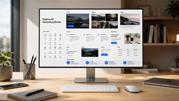
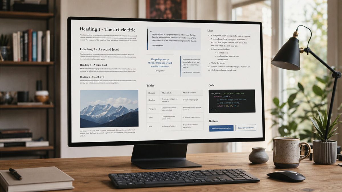
Every theme claims to be readable. This article is where you check ours. Below is one of each: the headings, the quotations, the lists, the tables, the code, the images and the rules that separate them — set the way Pulsar sets them, at the measure it uses, with the spacing it puts between them. Nothing here is a picture of a demo: it is the theme drawing its own text.
The body you are reading is the size you chose in Colours and typography. Inside it live the ordinary things: bold for the word that carries the sentence, italic for a title or a foreign term, a link that has to be visible without shouting, inline code for the name of a file or a function, and the occasional highlighted phrase when something must not be missed.
Headings, from the loudest to the quietest
Heading 2 – A second level, for a section inside an article
Four levels, each a step down from the one above. The distance from the paragraph that precedes a heading is deliberately larger than the distance to the one that follows it: a heading belongs to the text underneath, not to the text before.
Heading 3 – A third level, for a section inside a section
Use this one when a long piece needs signposts. Three or four of them turn a wall of text into something a reader can scan before deciding to read.
Heading 4 – And a fourth, quieter still
Below this level a heading stops looking like a heading and starts looking like bold text, which is why the theme offers four and not six.
Quotations
Five shapes, and they are not interchangeable. A quotation is somebody else’s words, kept in the flow of the article. A pull quote is your own sentence, lifted out of the flow to be read before the paragraph it came from.
Quotation
A page of text is a page of decisions. How wide the line, how far apart the lines, where the eye rests: none of it is decoration, all of it is whether the piece gets read to the end.
A typographer, on being asked what typography is for
The bar down the side is the brand colour and the panel behind it the same colour at a fraction of its strength, so a quotation belongs to the site it appears on. The line under it is the attribution, which can be left out.
Without an attribution the box closes on the last word, and nothing is left hanging under it.
Pull quote, centred
The pull quote says the one thing you would want a reader to remember if they read nothing else.
Every editor, eventually
Pull quote, to one side
It can also stand beside the article, with the text running past it. At this width it holds one sentence: a side quote that needs three lines has stopped being a quote and become a paragraph in a costume.
A quote set beside the text is read before it, so it had better be worth arriving early for.
The rule nobody writes down
This one is on the left, and the text keeps its measure and flows around it the way it does around a picture. On a phone there is no room to set anything beside anything, so the quote takes the full width and the paragraphs go back to being paragraphs.
Give it a second paragraph so the wrap has something to wrap around. When the words run out before the quote does, whatever comes next clears it on its own: you never find a heading pinned to the side of a sentence in large type.
And this one is on the right, which is where a quote goes when the paragraph beside it starts a new idea.
The same rule, mirrored
Left and right behave identically, only mirrored: the same maximum width, the same space between the quote and the words, the same surrender to a single column when the screen is narrow. Which side to use is a question of where the reader’s eye already is.
Two side quotes in the same article are usually one too many. Three is a magazine spread, and this is a web page.
Pull quote, coloured
Any colour from the editor’s palette can go behind it. The rules above and below step aside when there is a panel of colour to hold the words instead.
Colour is the loudest thing on a page, which is why a quote gets one only when it is the point of the section.
Shane Doe
Lists
Bulleted where the order does not matter, numbered where it does, and nested when one point contains others.
- A first point, short enough to be read at a glance.
- A second one, long enough to wrap onto a second line, so you can see how the indent behaves when the text runs on and the bullet stays where it was.
- A third, with children:
- a nested item
- and another, to show the second level
- Write the piece.
- Read it out loud and cut what you stumble on.
- Only then choose the picture.
Pictures
An image on its own, with a caption underneath. The caption is smaller and quieter than the body, because it explains the picture rather than competing with it.
An image can also sit beside the text. The paragraph wraps around it and keeps its rhythm; on a phone the picture takes the full width instead, because a column that narrow has no room to wrap.
This is the text that runs alongside it. Notice that the space between the picture and the words is the same on every side of the article, and that the first line of the paragraph starts level with the top of the image rather than a few pixels below it. Small things, both, and both the kind of thing you only notice when they are wrong.
A second paragraph, so the wrap has something to wrap around. When the text runs out before the image does, the next block clears it on its own: you never end up with a heading pinned to the side of a photograph.
Tables
A table earns its place when two things have to be compared line by line. On a narrow screen it scrolls sideways inside its own box rather than squeezing the columns into unreadable slivers.
| Element | Where it helps | Where it does not |
|---|---|---|
| Heading | Breaking a long piece into parts | Every third paragraph |
| Pull quote | One sentence worth remembering | Repeating what is already above it |
| Table | Comparing values across rows | A list wearing a costume |
| Rule | A change of subject | Decoration between paragraphs |
Code
Inline, as in wp_enqueue_style(), or as a block when the reader is meant to copy it. The block keeps its own spacing and never wraps a line in the middle of a token.
add_filter( 'pulsar_most_viewed_ids', function ( $ids ) {
    // Hand the widget your own list, and it stops guessing.
    return [ 12, 34, 56 ];
} );
Buttons
Two of them, filled and outlined, in the colour of the palette in use.
That is the whole vocabulary. If a piece of writing needs something that is not on this page, it probably needs an editor rather than a block.